



 By Taulant Balla
•
1 Mar 2016
•
Updated 24 Jun 2026
•
6 min read
•
Training & Corporate Materials
By Taulant Balla
•
1 Mar 2016
•
Updated 24 Jun 2026
•
6 min read
•
Training & Corporate Materials
Aesthetic instructional design is the intentional use of visual elements, including layout, color, typography, and imagery, to support learning goals. When applied well, it reduces cognitive load, improves retention, and makes training materials easier to engage with. In short: how your materials look directly affects how well people learn from them.
For training and consulting teams managing print materials, visual design can make the difference between a success story and an untrained team. If visual design feels like a last-minute consideration in your process, you may be leaving one of your most effective learning tools on the table.
What Is Aesthetic Instructional Design?
Aesthetic instructional design is the practice of aligning visual form with instructional function. It’s not about making materials look pretty. It’s about using design intentionally so that the way something looks actively helps people learn.
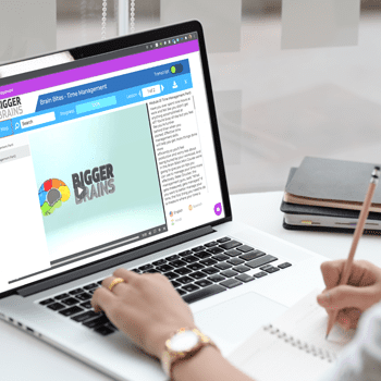
That applies to every format you produce: online courses, slides, handbooks, workbooks, manuals, and printed job aids for learning. Humans are wired to respond to good design, and learners are no different. Visually clear, well-organized materials signal credibility, reduce confusion, and keep learners engaged longer.
How Does Visual Design Affect Learning Outcomes?
Well-designed training materials improve outcomes in three concrete ways.
They guide attention. A clear visual hierarchy helps learners notice what matters first, before they’ve read a single word.
They reduce cognitive load. Consistent layouts and logical organization mean learners spend less mental energy deciphering the interface and more on the content itself.
They build trust. Professional, consistent design signals that the material is credible and worth engaging with.
When learners find materials easy to navigate and visually appealing, they’re more likely to stick with them and retain what they learn.
Why Do Visually Appealing Training Materials Work Better?
Captures attention
Simple, focused layouts draw the eye to essential information. Hierarchy and white space make important elements stand out without overwhelming the page.
Enriches perception
Decluttered pages, purposeful imagery, and coherent layouts make content easier to take in. When extraneous visual noise is removed, the signal comes through more clearly.
Increases comprehension
Generous white space and clear grouping give content room to breathe. Consistent visual patterns help learners process information more efficiently.
Improves credibility
Consistent color, typography, and spacing convey professionalism. Repetition in style signals quality and design intent.
Enhances usability
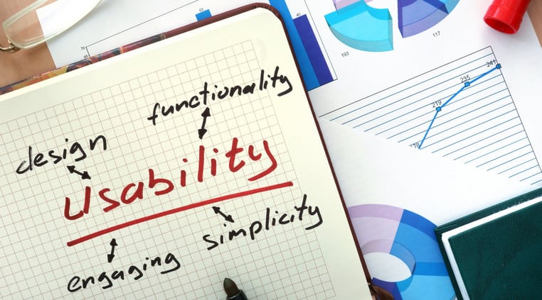
Good aesthetics simplify navigation and reduce errors. Learners judge well-designed materials as easier to use, which leads to a better experience overall. Even in blended learning environments, aesthetics matter.
What Are the Core Principles of Aesthetic Instructional Design?
You don’t need to be a graphic designer to apply these. A few foundational principles go a long way.
- Clarity and hierarchy: Use size, weight, and placement to show what matters most.
- Consistency: Repeat colors, typography, and spacing to create coherence across your materials.
- White space: Give elements room to breathe. Crowded pages increase cognitive load.
- Alignment and proximity: Align edges and group related items to support scanning.
- Contrast and emphasis: Differentiate sections and call attention to key points.
- Accessibility: Ensure sufficient contrast, use alt text for images, and choose readable type sizes so every learner can engage with your content.
How Should You Use Color in Training Materials?
Color guides attention, signals meaning, and organizes content. A restrained palette is almost always more effective than a complex one.
A good starting point: choose one primary brand color and one or two accent colors for emphasis. Use warm accents to highlight actions and calls to action, and cooler tones for backgrounds. Make sure your color combinations meet accessibility contrast standards, and never rely on color alone to convey meaning. Pair it with labels or icons so the information lands clearly for every learner.
Why Does Typography Matter in Instructional Design?
Typography shapes how readable, credible, and organized your materials feel. Two complementary typefaces, one for headings and one for body text, are usually enough. Maintain ample line spacing, keep line lengths comfortable for reading, and use typographic scale and weight to create structure.
Avoid decorative fonts that slow readers down. Clear, consistent typography helps learners scan and absorb information quickly, which is exactly what you want in a training context.
How Do You Get Started with Better Instructional Design?
The biggest shift is treating visual design as part of the instructional design process, not something you address after the content is finalized.
Sketch layouts early. Define a simple color and type system before you start building. Get feedback from real learners to confirm your materials are communicating clearly. Small, intentional design decisions compound over time, and the result is training that not only teaches well but that learners actually want to engage with.
If you already have content prepared, you can update your training content to align with your new visual design principles.
Key Takeaways
- Aesthetic design is not a finishing touch. It’s a core part of how people learn.
- Visual hierarchy, consistency, and white space reduce cognitive load and improve retention.
- A restrained, intentional color palette is more effective than a complex one.
- Typography choices affect readability, credibility, and how quickly learners can scan content.
- Accessibility and good aesthetics are not in conflict. They reinforce each other.
- Plan for visual design from the start, not the end.
Looking to pair great design with great print quality? Explore how Mimeo can help you produce training materials that look as good as they teach.
Frequently Asked Questions
What is aesthetic instructional design?
Aesthetic instructional design is the intentional use of visual elements, including layout, color, typography, and imagery, to support learning goals. It ensures that how materials look actively helps learners understand and retain content.
Does visual design really affect learning outcomes?
Yes. Research shows that well-designed materials reduce cognitive load, improve comprehension, and increase engagement. Learners are more likely to trust and persist with materials that are visually clear and professionally designed.
What are the most important design principles for training materials?
The most impactful principles are visual hierarchy, consistency, white space, alignment, contrast, and accessibility. Together they make materials easier to scan, understand, and use.
How do I make training materials more visually appealing without a design background?
Start with a simple, consistent color palette, choose two complementary fonts, and use white space generously. Avoid clutter and let hierarchy do the work of guiding attention. Small, deliberate choices make a significant difference.
What role does accessibility play in instructional design?
Accessibility ensures that every learner can perceive, navigate, and understand your materials regardless of ability. That includes sufficient color contrast, readable font sizes, alt text for images, and layouts that work for screen readers. Accessible design and good aesthetics support each other.
This article was co-authored by Connie Malamed. Connie Malamed is a consultant, author and speaker in the fields of online learning, visual communication, and information design. She is the author of Visual Design Solutions and Visual Language for Designers and publishes The eLearning Coach website and podcast. Connie has helped nonprofit, government, and corporate clients transform their content into interactive learning experiences for more than 20 years. She has degrees in art education and instructional design.

Taulant Balla
Senior Digital Developer
Taulant Balla is a Senior Developer at Mimeo, with 15+ years' experience building and optimizing web properties for the print industry. He focuses on web performance, technical SEO, and front-end development across high-traffic sites. His posts help print and marketing businesses understand how the technical side of their web presence directly affects discoverability and customer experience.

 Mimeo Print
 Mimeo Digital for Participants
 Mimeo Marketplace
 PrintX
 Mimeo Photos